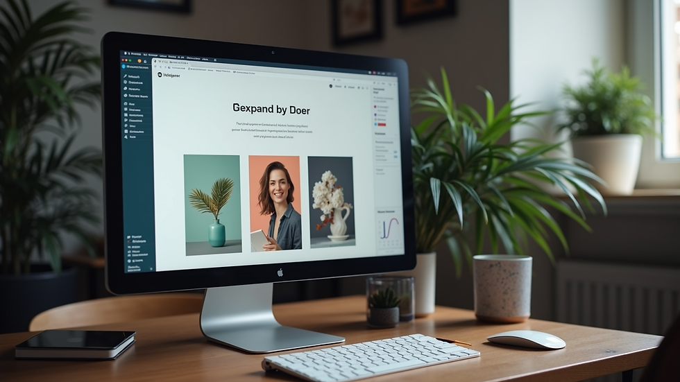
The Importance of Responsive Web Design Templates
- WIXFULL
- Dec 8, 2025
- 3 min read
Updated: Feb 2
Responsive web design templates are pre-built layouts that automatically adjust to different screen sizes. This flexibility is crucial because mobile traffic now dominates the web. If your site isn’t mobile-friendly, you risk losing visitors and potential customers.
Here’s why these templates matter:
Device adaptability: They ensure your site looks perfect on phones, tablets, and desktops.
Faster development: You don’t start from scratch. Templates speed up the build process.
Consistent branding: Templates maintain a uniform look across devices.
SEO benefits: Google favors mobile-friendly sites, improving your search rankings.
Using responsive website templates means you get a head start with a design that’s already optimized for performance and usability. This is a game-changer for anyone wanting to launch quickly without sacrificing quality.

How Responsive Web Design Templates Boost User Experience
User experience (UX) is king. Visitors expect smooth navigation, fast loading, and readable content no matter what device they use. Responsive templates deliver all that by design.
Improved readability: Text and images resize automatically, so users don’t have to zoom or scroll sideways.
Intuitive navigation: Menus and buttons adjust for touchscreens or mouse clicks.
Faster load times: Optimized templates reduce unnecessary elements, speeding up page loads.
Reduced bounce rates: When users find your site easy to use, they stay longer and explore more.
For example, a startup launching a new product can use a responsive template to showcase features clearly on mobile and desktop. This keeps potential customers engaged and increases conversion chances.
Save Time and Cut Costs with Ready-Made Templates
Building a website from scratch can be expensive and time-consuming. Responsive web design templates eliminate much of that hassle. You get a professional design without hiring a full development team.
Quick setup: Templates come with pre-designed pages and elements. Just swap in your content.
Lower development costs: Less custom coding means fewer billable hours.
Easy updates: Templates are built to be flexible, so you can tweak layouts or add features without breaking the design.
Reliable support: Many template providers offer ongoing updates and help.
This approach is perfect for professionals who want a polished site fast. You can focus on your business while the website works seamlessly behind the scenes.
Customization Without Complexity
One common misconception is that templates limit creativity. That’s not true with modern responsive web design templates. They offer a solid foundation but allow plenty of customization.
Drag-and-drop editors: Change colors, fonts, and layouts easily.
Modular design: Add or remove sections to fit your brand’s needs.
Integration options: Connect with marketing tools, social media, and e-commerce platforms.
Scalable design: Start simple and expand as your business grows.
For example, a brand can start with a clean, minimal template and later add a blog, portfolio, or online store without rebuilding the site. This flexibility saves time and keeps your digital presence fresh.
SEO and Performance Advantages
Search engines reward websites that perform well on all devices. Responsive templates help you meet these criteria effortlessly.
Single URL structure: No need for separate mobile and desktop sites, which simplifies SEO.
Faster page speeds: Optimized code and images improve loading times.
Better crawlability: Search engines can index your content more efficiently.
Higher rankings: Mobile-friendly sites rank better in Google search results.
By choosing a responsive template, you’re investing in a site that’s built to attract and retain organic traffic. This aligns perfectly with goals of measurable online growth and efficient digital operations.
Enhancing Your Brand's Online Presence
Creating a strong online presence is vital for any business. A responsive website not only looks professional but also reflects your brand's values. It builds trust with your audience. When visitors find your site easy to navigate, they are more likely to engage with your content and services.
Showcase your brand: Use templates to highlight your unique selling points.
Engage with visitors: Integrate features like chat support or contact forms.
Drive conversions: Use clear calls to action to guide users toward desired actions.
This approach ensures that your website serves as a powerful tool for growth. A well-designed site can convert casual visitors into loyal customers.
Final Thoughts on Responsive Web Design Templates
Responsive web design templates are a smart choice for anyone serious about building a high-performance website on Wix Studio. They combine speed, flexibility, and SEO benefits in one package. Whether you’re launching a startup, growing a brand, or establishing a professional portfolio, these templates give you a competitive edge.
Don’t waste time reinventing the wheel. Use a proven template to create a stunning, user-friendly site that works everywhere. Your visitors will thank you, and your business will thrive.
Ready to get started? Explore the best responsive website templates and watch your online presence soar.


